001 / 012
HackerRank Branding
Role:
Lead Brand Designer
Tools:
Figma
The Opportunity
Upon joining the HackerRank team on a contract, it was exciting times underway. With lots of changes looming came lots of opportunities to redefine the brand in order to better tell the HackerRank story. Our brand team consisted of myself, another brand designer and the VP of design. While we had some great brand assets being used, it was starting to feel like we were losing consistency and ultimately the identity. A brand guide was needed to improve said consistency and provide a toolkit/lookbook for ourselves as well as the greater team.
The Process
Our team of three worked pretty closely to collect and organize examples of: what was working well, what wasn’t, and what inspiration felt inline with our direction. A few jam-packed Figma files later, the three of us each took our own time to digest and explore possible directions.
Ensuring that each element was intentional and laddered back up to our core messaging, we had plenty of strong visuals. This is where I began to combine, consolidate and take things a bit further. I found it helpful to start laying out the shell of this guide during this stage, and combined aspects of each of our explorations that felt the strongest. During this process, we also collected some key stakeholder gut-check feedback which helped further steer the ship in the right direction. As I laid each of the spreads out, I sought to polish each section and make sure that things all felt connected to one another. Whether it was creating consistencies through color, stroke/line weights or imagery, it all started to feel like a big happy family of brand elements.
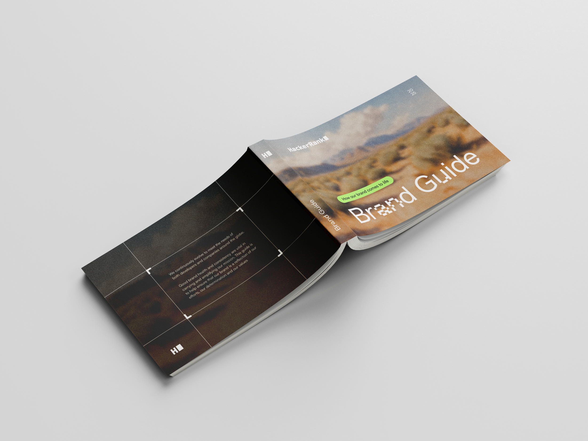
Once there was a rough outline per spread, I began thinking about the best ways in which these elements could be explained and absorbed by not only other designers, but other team members as well. The result, was a creative expression guide comprised of approximately 40 pages of ways in which the HackerRank brand comes to life through visuals experiences.
The Result
The new direction and guide were well received and quickly given the stamp of approval to solidify and start using. As with most sets of branding rules, it will be a living breathing document that will be expanded on and updated as needed. For now, it’s a handy tool helping to create something that is vital in any companies’ success, consistency. A rulebook on how to show up internally and externally across each and every touchpoint. Creating stronger, more memorable experiences and first impressions for our business.