005 / 012
Bento Grid Designs
Role:
Lead BrandDesigner
Tools:
Figma
The Opportunity
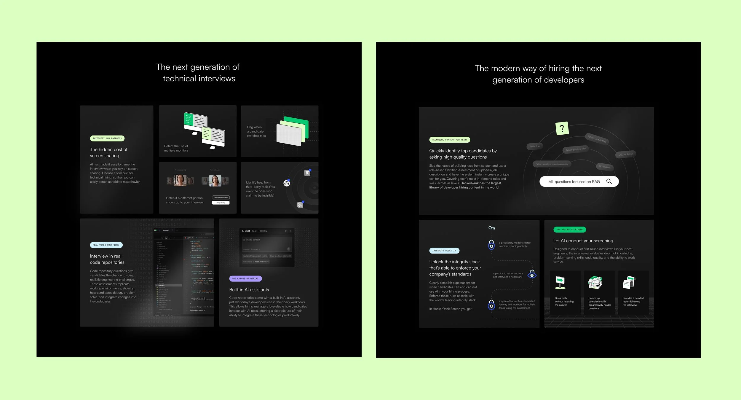
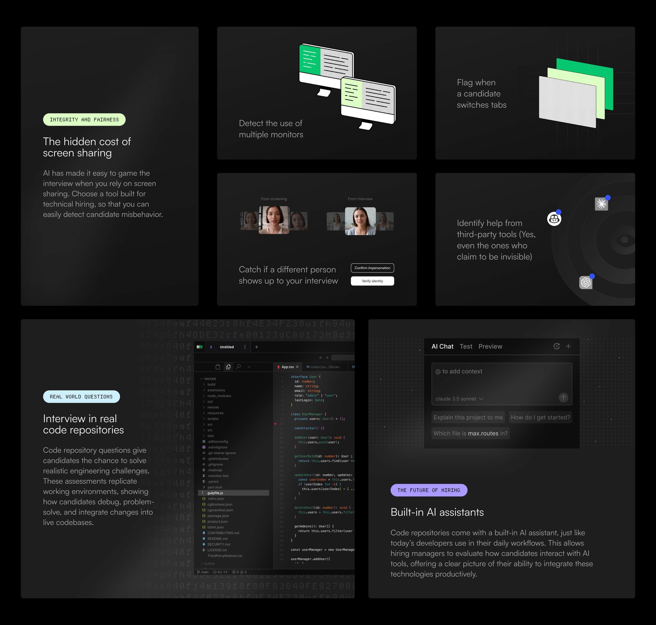
Contracting for HackerRank, I was presented with an opportunity that I’d seen many times throughout my experience. A design challenge as common as ever - having a rich amount of content but having it feel so dense that it loses appeal and leads to drop-off. The product copy that I was working with was gold, but not exactly coming across as such in the layout nor the presentation. I was able to utilize the trending, “bento grid” design approach to make these pages feel more digestible, engaging and allow all of this content to work much harder.
The Process
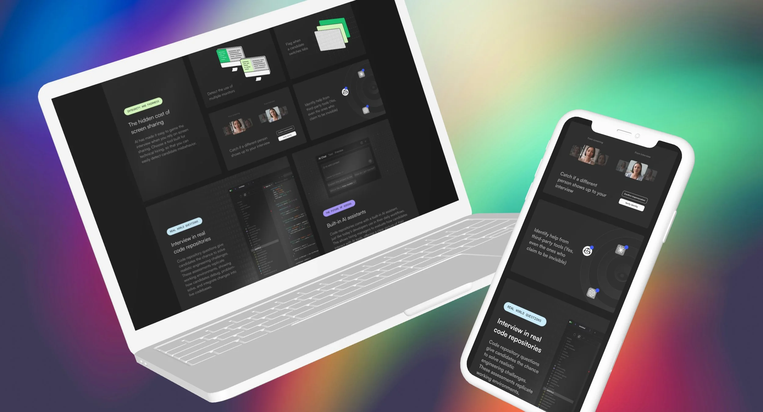
I worked with our Marketing Director, to identify two key site pages in which we wanted to explore this new approach. She was also kind enough to give me a clear rundown of the goals of each section. From here, I dove into Figma and got started thinking through grid layouts that would make sense and allow the content to really shine. I wanted to be somewhat sparing and meaningful with the imagery used, often-times borrowing from the user interface but pairing with brand patterns and geometric shapes to compliment. I’ve been designing these sections out in Figma to be easily plugged into Webflow.
The Result
This is a current project as I’m typing this, with the goal of carrying this same style over to a few more pages where it makes sense. Our V2 of these designs would ideally include a hover state in which they incorporate subtle animation to help tell the story and make the pages even more sticky.